Converting website visitors into clients can be tricky, especially in financial services.
That’s why we’re sharing lead generation tips specifically for financial advisors on creating effective calls-to-action (CTAs) to convert more of your website traffic into business.
So you’ve built your website and put in the work to brand yourself online.
That’s an important and necessary first step.
But, how do you go about actually converting visitors once they land on your website?
You won’t do it without the right call-to-action (CTA).
CTAs serve as the final piece in your puzzle for converting website visitors and getting more clients.
What Is A Call-To-Action?
When it comes to lead generation, you have to first focus on building trust. Why?
Few people who come to your website for the first time will be ready to work with you immediately.
Their ‘trust’ in you depends heavily on the value they think you can provide them.
This is why every web page and piece of content you create should have a strategic, well-crafted CTA that can guide the visitor into a decision-making process.
A call-to-action is a statement on your website that encourages visitors to take a specific action. It lets the visitor know exactly what action to take, why, and how to take it. CTAs can come in the form of a clickable button or hyperlinked text.
For example, let’s say you had a statement on your website like this:
Want to find out how you can lower your debt? Schedule a FREE consultation today.
It would be advisable to have a button that says ‘Book Now’ located right underneath that text.
So how do you dive into creating a compelling and persuasive CTA that can convert website visitors?
Let’s take a closer look into crafting CTAs that can drive more of your website’s leads to convert.
1. Your CTAs Stand Out
CTAs need to stand out.
They don’t have to be fancy, but they do need to grab the reader’s attention.
You don’t want them to blend in with the rest of your page design, but you do still want them to be cohesive with your branding (fonts and brand colours).
The colour of their CTA button ‘Firm Principals’ sticks to their brand style while standing out from the background.
It also drives the visitor to learn more about their principles, which builds trust.
2. Your Words Matter
It’s no wonder why, who doesn’t like free stuff?!
Your copy plays a big role here.
Experiment with your copy to determine which yields the best conversions.
You could try action words like:
- Download My Beginner’s Budget Template Now
- Book A Free Call
- Schedule A Complimentary Audit Session
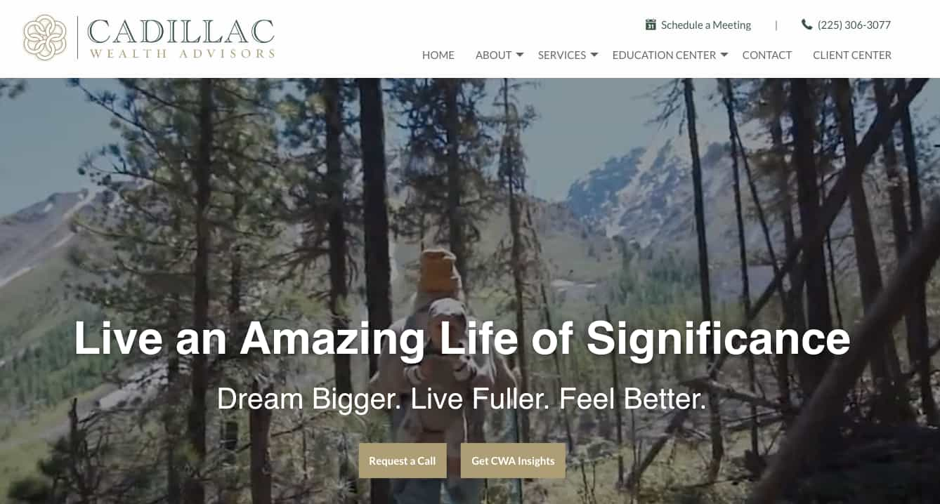
They know what their target audience is looking for, and are providing them with a way to get in contact (Request a Call) or to learn more (Get CWA Insights), as soon as the visitor lands on their homepage.
Keep in mind that this is just the first step in your potential client’s buying journey.
Potential clients feel much more at ease with hiring you once they’ve had a face-to-face (or virtual) conversation with you, so make it as easy as possible for them to contact you.
3. You Provide Direction
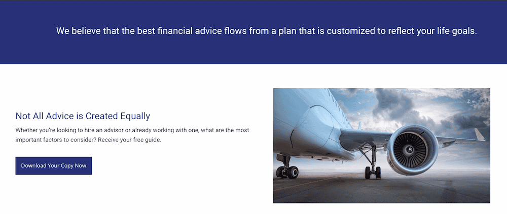
A website without a strong CTA is like a pilot trying to land at an airport without runway lights.
lack of direction can be confusing, especially for first-time website visitors.
Just as you’d want to create the best conditions for a pilot to land safely, you also want to make sure you give your potential clients flawless directions on where to ‘land’.
Whether it’s by showing them where they can ‘Learn More’, or if you want them to ‘Book A Call’ – strategic placement of a CTA that leads them to where they need to go is key.
There is no one-size-fits-all when it comes to CTAs.
Sure, you could use ‘Learn More,’ or “Download’ but you want your visitors to feel like your website was created with their individual needs in mind.
This is why using copy that your target audience would most associate with, in the way that they would like to interact with, will drive more results.
4. You Address The Needs Of Your Target Audience
This is the final and most crucial point for getting a potential client to click on your CTA.
As mentioned earlier, you need to build trust for your website visitors to convert into clients.
One of the best ways to build trust is by actually helping your potential client get a little closer to reaching their financial goal BEFORE they even think about hiring you.
When it comes to lead generation for advisors, you have to first show that their needs WILL be met if they decide to hire you.
You can do this by learning about their desires, frustrations, and pains. You will come to know exactly what they want, but also what they want to avoid.
They work with professional hockey players, and use imagery, copy, and CTAs that speak directly to the interests and needs of their target audience.
By using a CTA like ‘The Game Plan’ they are signalling to their website visitors that they know exactly what they’re going through and they are experienced and ready to help.
Note that people do not like being tricked into clicking on buttons that lead to something of no value (a.k.a ‘clickbait’).
Keep your CTAs informative and explicitly tell the reader what they can expect when they click.
Will they be signing up for a newsletter, or will they be taken to a form to schedule a consultation?
In the example above, the copy that leads into the CTA explains what their perfect target client may be thinking and experiencing. It’s designed to engineer the “that sounds JUST like me!” response.
If you can show that you understand what your potential client is going through and empathize with them, they are much more likely to believe that you can help them navigate and overcome their obstacles.
Conclusion
Creating the perfect CTA can be overwhelming and a bit confusing at first. After all, there are many different best practices and guidelines out there.
No matter what approach you take, converting website visitors means you should never abandon these 4 components of a great CTA:
- Make your CTA easy to find. Don’t be afraid to go too ‘hard sell’ in fear that it’ll turn potential clients off – if you’re already providing them great value, they’d be more than happy to click on that CTA.
- Choose your words carefully! Use action-driven, personalized words to reel them into the buying process.
- Provide direction by telling your readers exactly where to go next. Keep it straightforward and easy to navigate.
- Attract your audience by addressing their needs. Approach any potential objection they may have and tell them the value they’ll get from clicking your CTA.


